Aimer
2017-2020
Large screen BI UX design
Data visualization
Aimer needed a united way of displaying data for their internal data reporting systems. Including their overall design that allowed access to their different departments, as well as their ERP and CRM systems. These systems were visualization intensive, so collaboration with subject matter experts was key to creating successful designs.

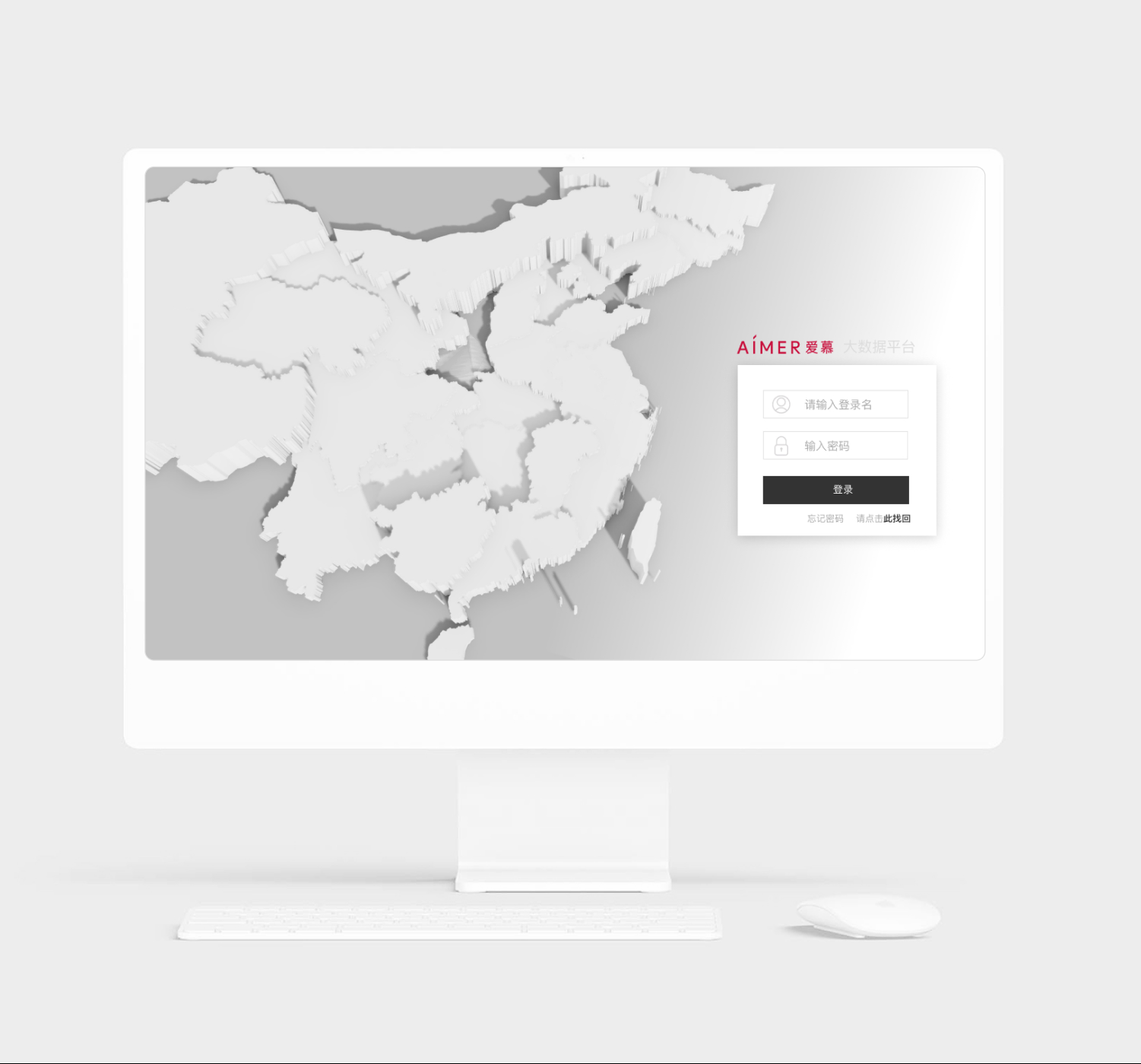
The implemented design of the login to the Aimer data platform designed to display daily geographical sales trends.
Results of Infodesign Studio lead workshops and staff collaboration resulted in visualizations that supported users to understand data across a range of media, including large touch screen dashboards, desktop dashboards, and a mobile data reporting system.
The implemented design of the login to Aimer’s data platform designed to display daily geographical sales trends.

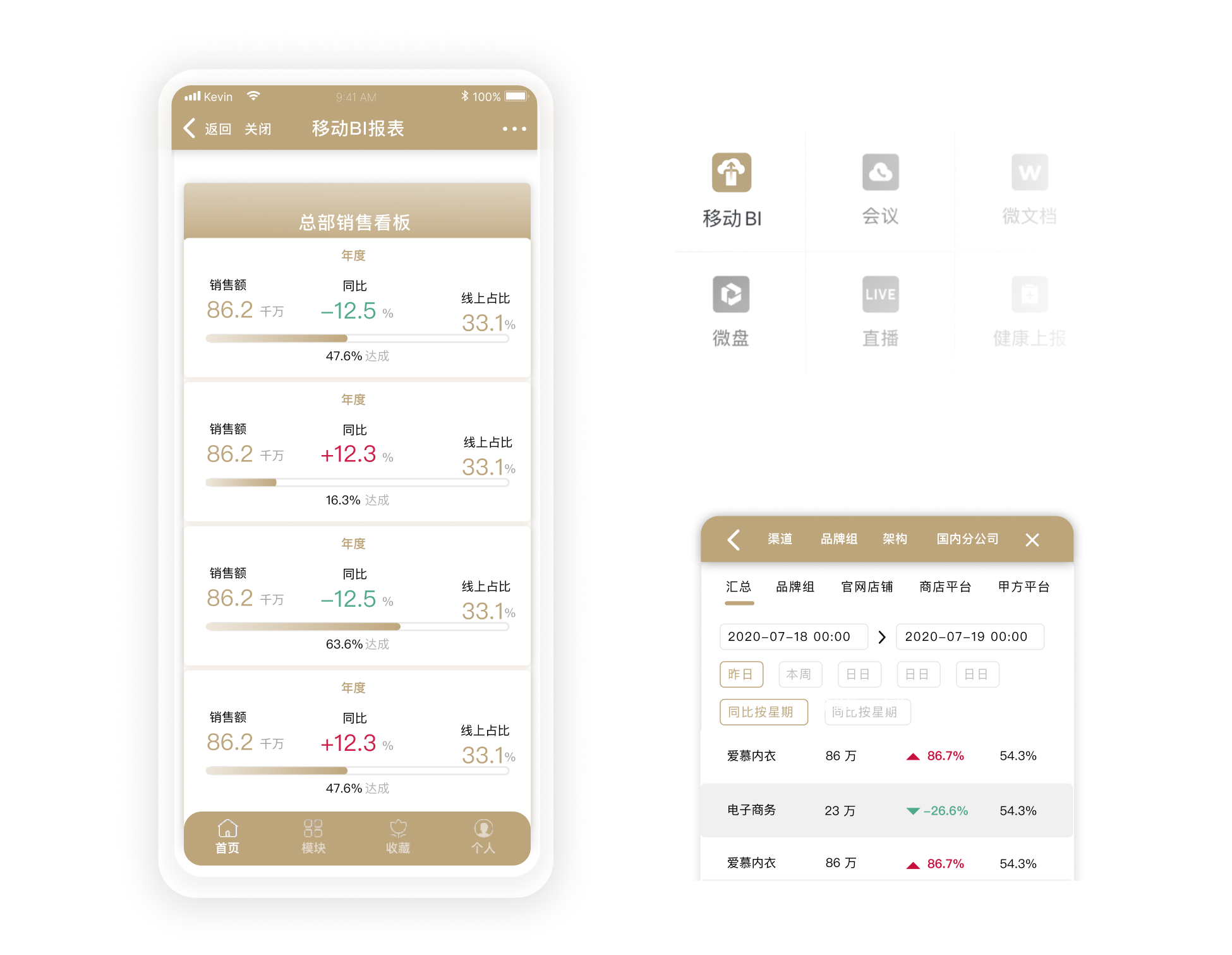
UI design for mobile data (left). UX design so analysts can easily find their data (right).

UI design for mobile data (left). UX design so analysts can easily find their data (right).
Infodesign Studio worked together with the development team from Blue Hero, ensuring visualizations were feasible with D3, e-charts, and other front end technolgy.
